
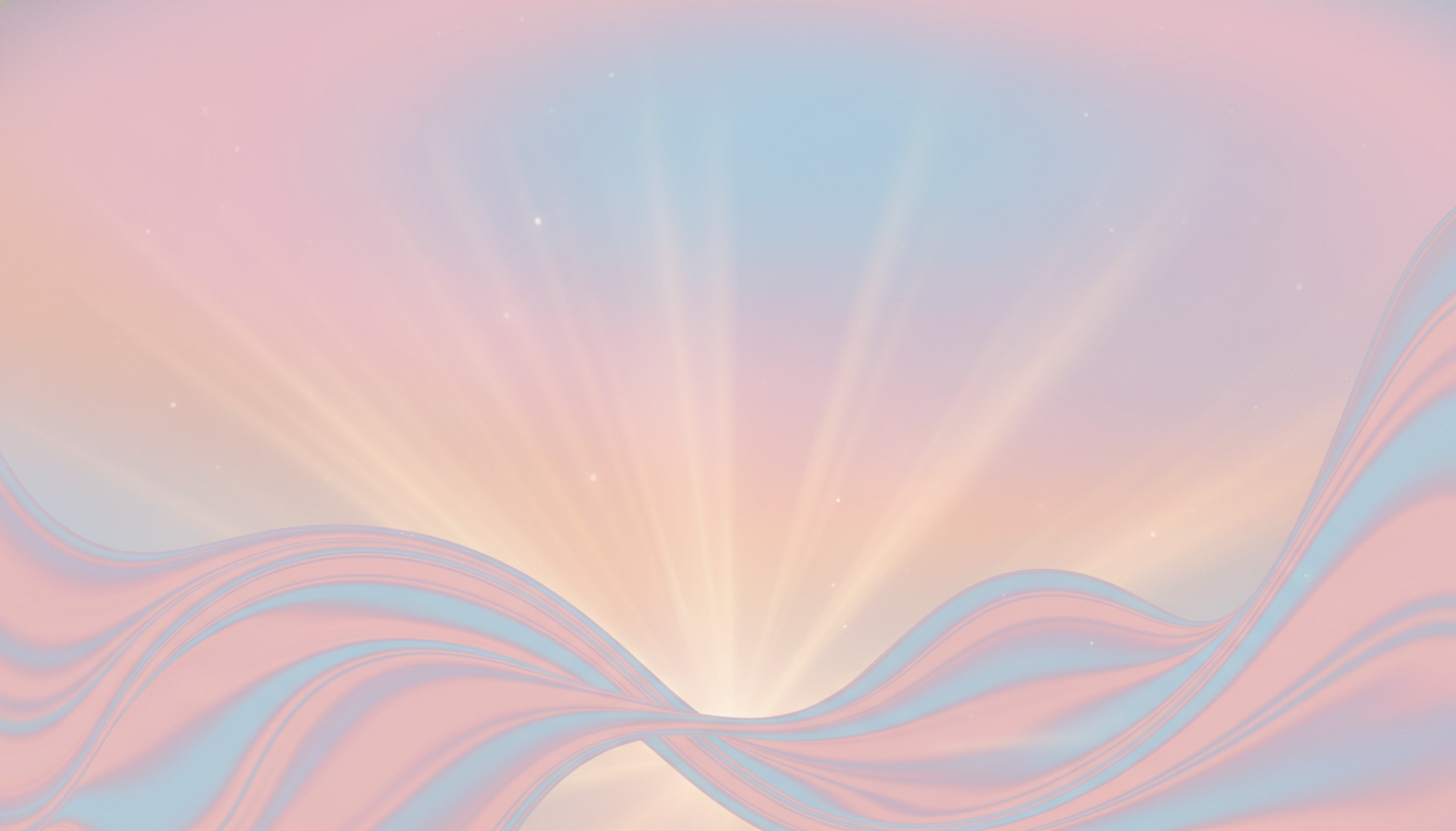
Give your designs a soft, glowing style that draws attention and feels modern. A gentle gradient with pastel tones adds subtle light and texture to any poster, phone wallpaper, or website cover. Keep shapes simple — a heart or neon pattern can add charm without clutter.
Choose colors that match your brand energy and the motivation behind the image. Blue and purple palettes work well for calm, mysterious vibes, while pink and neon choices feel playful and bold. Blurred gradient effects create depth and make text or illustrations pop.
Explore curated collections and see how each design adapts across social media, print, and digital templates. For insight into color symbolism and lighter visuals, visit a helpful guide on aura reading.
Key Takeaways
- Soft gradients add a glowing light effect that catches the eye.
- Pastel palettes make wallpapers and covers look fresh and modern.
- Use simple shapes like hearts or neon patterns for strong visual cues.
- Pick blue or purple tones to match a calm or mysterious mood.
- Blurred gradients and light textures help images feel layered and professional.
Understanding the Appeal of an Aura Background
Designers tap into subtle light and color to make visuals feel more personal and alive. Choosing a distinct visual style helps an image or wallpaper convey mood at a glance.
The Psychology of Color and Energy
Color choices influence emotion. For example, yellow often signals awakening, motivation, and release of anger. Pastel pinks bring softness and love, while deep purple adds mystery.
Why Blurred Gradients are Trending
A blurred gradient creates a soft texture that invites the eye to linger. This effect makes illustrations, posters, and phone wallpapers feel immersive and tactile.
- Selecting a specific aura gradient means choosing light interaction and style for your design.
- Analyzing shape and glow helps a poster or phone wallpaper stand out on social media and wall displays.
- Many creators favor pastel tones or neon accents to match brand energy or theme.

For more on color meanings and how hues affect healing and mood, see color and energy.
Top Providers for Your Aura Background Needs
You can find high-res gradient collections that make it simple to build a glowing, professional image. Many top-rated providers offer large collections of editable templates for wallpapers, posters, and website covers.
Look for high-resolution files so your image works on a phone screen and a printed poster. Good services include options for vector and PNG exports, plus layered files for easy text and illustration placement.

Providers often showcase a unique blurred gradient effect and layered texture that adds depth to designs. Whether you need a soft pastel heart pattern or a neon light style, these platforms let you preview gradient backgrounds and color swaps before download.
Pro tip: Check collections that include templates for social media and website covers. For a quick list of related creative resources, see these top resources.
- Customizable templates: save time and keep a consistent style.
- High-res downloads: suitable for web and print.
- Texture and glow effects: add professional depth to every image.
Customizing Your Visuals with Energy and Color
Begin with one dominant hue and build layered gradients, textures, and shapes around it for a cohesive look.
Selecting the Right Palette for Your Brand
Orange signals independence and courage. Use an orange aura or a soft orange background to suggest stepping out of a comfort zone.
Layer a blurred gradient over a pastel wallpaper to keep the image soft while adding a neon light effect for pop. Small shapes, like a heart or circular pattern, help guide attention.

Professional designs use a single aura gradient across social media templates and covers to create a unified style. Try purple or pink tints if you want mystery or gentle warmth.
- Pick a dominant color, then test three gradients for tone.
- Add texture lightly so text and illustration stay readable.
- Keep templates consistent for posters, phone wallpapers, and cover images.
“Consistent color choices increase recognition and motivate your audience.”
For more ideas on how color and energy shape perception, check curated lists like best online tarot readings.
Conclusion
Conclusion
A well-chosen gradient and light texture can turn a simple wallpaper into a signature image that fits your style and brand energy. By using color psychology and subtle texture, your design gains depth and emotional impact.
Whether you design for a phone or a large poster, the right effect lifts an illustration or image and makes text readable. Explore trusted providers to find high-res wallpapers, layered files, and neon or heart shapes that suit your needs.
Ready to refine your visuals? See curated examples like tarot card art to spark ideas and choose the perfect aura background for your next project.